
Practice Exams Rebuilt: Shuffled Answers, Clearer Results
On the first free SecAI+ and Claude Architect exams, the right answer was first on 21 of 22 questions. Answers shuffle now; the exam and results screens are rebuilt.
Builder of SecuSpark. 24 shipped projects across healthcare, defense, and education. Built this platform because textbooks never worked for my ADHD brain — so I turned exam prep into an RPG. @PawelBuilds
Table of Contents
This release ships next to the ten fixes players reported. Nobody reported what’s in this post. I found it by going through the practice exam, its results page and the flashcard tutor one screen at a time, logged out and on a phone. The worst find: on the first free SecAI+ and Claude Architect practice exams, the correct answer was the first option on 21 of 22 questions, and the other free exams for those two were nearly the same. Below is what was wrong and what changed. The short version is in the changelog.
Free exams showed answers in bank order
You can take a practice exam on SecuSpark without an account. When you’re signed in, each question’s options are shuffled, with your account as the seed. The function that did the shuffling handed the question back untouched when there was no account. A logged-out visitor saw every option in the order it sits in the question bank.
How much that mattered depended on the exam. I opened four of the free ones logged out and counted where the correct answer sat.
| First free exam for | Questions | Correct answer was the first option |
|---|---|---|
| SecAI+ | 22 | 21 |
| Claude Architect | 22 | 21 |
| PenTest+ | 25 | 7 |
| Security+ | 25 | 6 |
On the two AI exams, the one question that broke the pattern asked for two answers, and they were the first two options. Each of those certifications has 3 free exams, so I counted the other four from the question bank. They are nearly the same: across all six, 114 of the 115 questions with one correct answer had it as the first option. A free exam is the first thing most people try here, and on these you could get those questions right without reading them. On the PenTest+ and Security+ exams the correct answer sat first about as often as chance would put it.
Logged-out exams are shuffled now. Your browser picks a random seed the first time it opens an exam and keeps it on your device.
- Each browser gets its own order.
- Questions you haven’t answered keep their order through a reload or a resume.
- A retake reshuffles.
- While you work through an exam, an answered question’s options stay where they are, so the answer marked correct doesn’t move while you look at it.
Your score was never wrong. Scoring goes by which answer you picked, not by where it sat.
Signed-in accounts had a different problem in the same code. Their options were shuffled, but the order could change after you answered a question, while its result was still on screen, because the app worked the order out again whenever the question bank updated in the background. Now an answered question’s options stay put while you work through the exam, and the questions you haven’t answered keep their order through a reload. A retake still reshuffles.
After the fix I opened the two AI exams again, in two browsers. Each run got its own order, and the correct answer was the first option on between 3 and 9 of the 22 questions. With four options, chance puts it first about a quarter of the time. There’s also a new test that builds each certification’s first free exam from the real question bank and fails if the correct answer lands first on most of its questions.
A header that says what you’re taking
On desktop, the exam header printed the exam’s raw internal title. It now reads “PenTest+ PT0-003 practice exam”, followed by the topic that exam covers. The victory card you can share after a strong score names the exam the same way, and cards shared before this release now read the same.
The exam screen, rebuilt
I rebuilt the practice exam screen and the list you pick exams from. Answers are lettered A to D instead of radio circles, and each screen has one filled button for the next step. When you get a question wrong, your pick is tagged “Your answer, incorrect”, the right one “Correct answer”, and a line under the options says which letter was right. A wrong answer waits until you tap Next question. A correct one still moves on after a second.
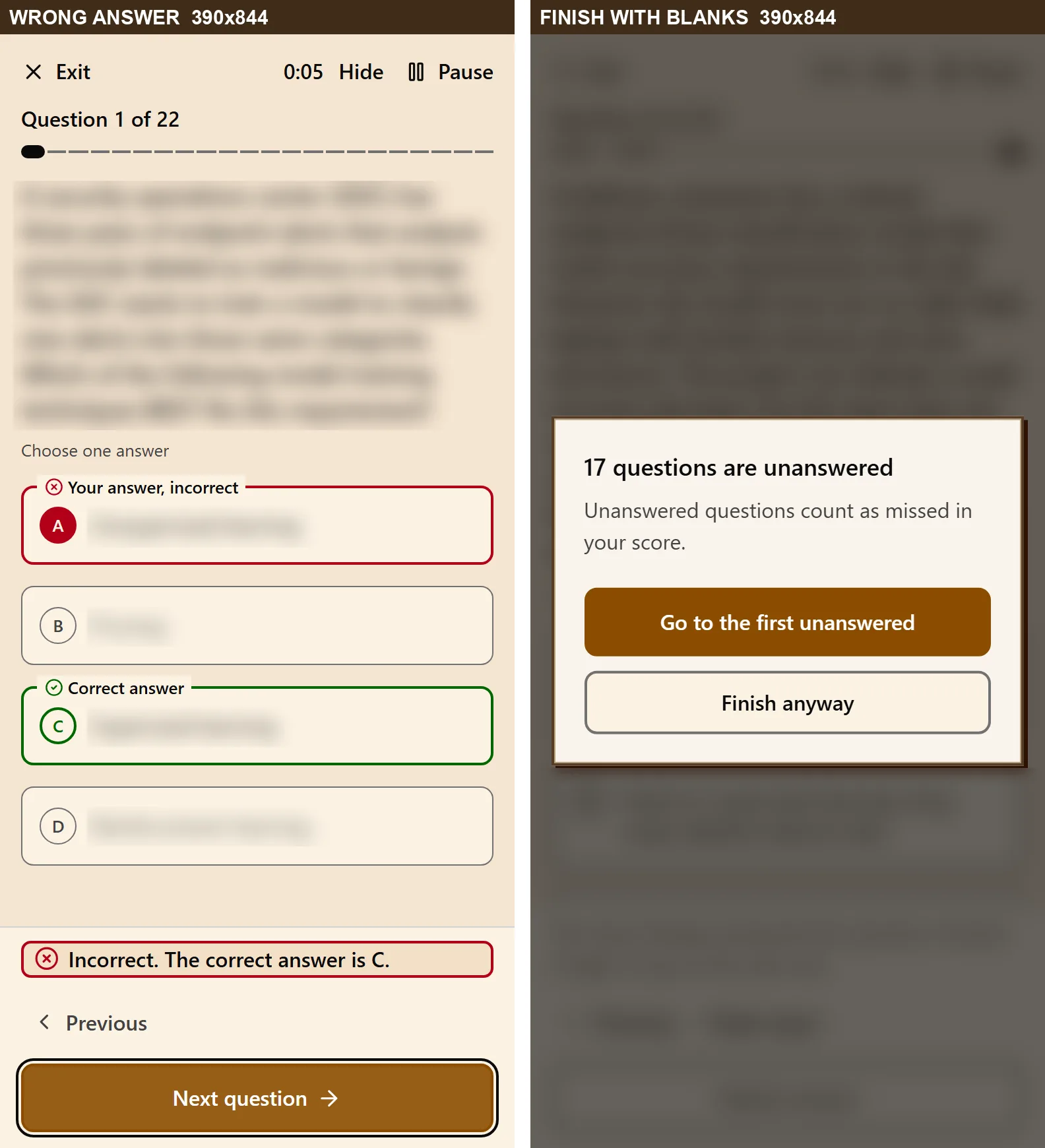
Finishing changed too. Tap Finish exam with questions left blank and the exam asks first: it says how many are unanswered, that they count as missed, and offers to take you to the first one. If you pick an answer and move on without submitting it, the button says Skip without answering, so you know that pick won’t count. After you finish, the button reads Finishing until your results open, and if that takes more than ten seconds it asks you to check your connection. Before, pressing Finish exam a second time while your results were slow to load could leave you stuck on the last question.
One fix here is for a bug on the live site. If you answered the very first question that appeared while an exam was reopening, the exam could jump away and your answer’s result would vanish from the screen. The answer itself was still saved. The first question now appears only after your saved answers are read.
The exam list is rows now instead of tall cards. Each row has the exam’s name, one line with its domain, question count, difficulty and XP, and then Start, your progress with Resume, or your score with Review, depending on how far you got. Resume also opens where you stopped. It could open question 1 if you had reached the list by typing its address.
I measured the contrast of the new screens from rendered pixels, in light and dark: none of the 112 text, border and focus-ring pairs falls below WCAG AA. Before, the outline around an answer measured 1.19:1 in light mode and the focus ring on Submit 1.21:1, against the 3:1 that borders and focus rings need. Three things are still open. I haven’t run a real screen reader on it; what it announces was checked from the page’s accessibility tree. A notification that’s showing can briefly hold keyboard focus at the end of a page. And a screen reader reads each answer’s letter run straight into the answer, with no pause.
The results page, rebuilt
The page after the last question was hard to use. Measured from rendered pixels across 120 states before this release, 646 of 14,192 text runs fell below WCAG AA contrast and 832 of 1,232 focus stops were under 3:1. An achievement pop-up covered your score when the page opened. On a 390px phone the missed questions were cut off with no way to scroll to them, and the domains tab read “0/0 correct, 0%” on every row.
Now the first screen tells you whether you passed, how close you came and what to do next. Your score sits next to a worded verdict, Passed or Not yet, with a straight gauge from 0 to 100 that has the 70% practice pass mark ticked on it, and a line saying how many more correct answers would have reached it. Under that, each domain shows how many you got right, and the one that cost you most says Most misses. The questions you missed are on the page itself. Each opens in place, with your answer tagged in words and the written explanation first.
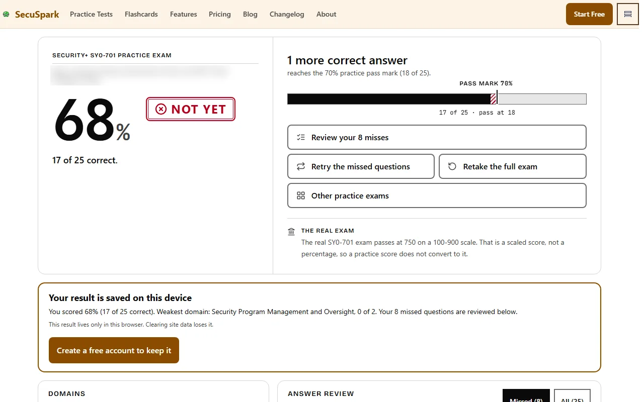
For Security+, Network+, CySA+, PenTest+ and SecAI+, a separate line gives the real exam’s passing score and says it’s a scaled score, so a practice percentage doesn’t convert to it.
The written explanation on each missed question is there for everyone. The deep dive under it, with why it matters, the common mistake and the exam trap, opens when you ask: a free account gets 3 a day, on the same daily count as the AI tutor, and premium has no limit. Opening a missed question used to call the AI tutor by itself, which cost a free account 1 energy each time. Now the tutor answers only when you ask it.
A few smaller changes. The achievement pop-up is gone; rewards are one line under your score. A sitting you didn’t finish says how many questions you answered and offers Resume the exam, instead of scoring as a fail. Retake asks before it clears your answers. Going back to an old result after a newer attempt says the result was replaced, instead of scoring the old one against your new answers. And the upgrade offer moved below the review. It shows only to signed-in free members who didn’t pass, not to guests or premium members.
The same contrast audit after the rebuild, over 136 states in light and dark, found none of 11,424 text runs below AA. Focus rings aren’t done: 151 of 1,064 focus stops still measure under 3:1, and 138 of those are in the header and bottom bar every page shares. Two more limits: on a phone, the space kept for the bottom bar doesn’t grow with larger text, and at 1024 by 768 a few small labels render smaller than 10 pixels.

Quick win, no signup
Try 5 free Security+ practice questions
No signup required. 3 free exams per cert to start, with premium AI deep dives available when you upgrade.
The AI Tutor on a phone
Every flashcard has an AI Tutor. On a 390 by 844 phone it opened as a box 251 pixels tall at the bottom of the card, and you read a full explanation by scrolling inside that box. It now takes the whole card, from under the tabs down to the rating buttons, which is about twice the height.
The tutor has six modes: Explain, Socratic, Connect, ELI5, Quiz and Tips. On phones they were six icons with no labels, and the sixth was cut off at the edge of the screen. They’re labeled buttons now, three per row. On desktop they’re text only, and hovering one tells you what the mode does.
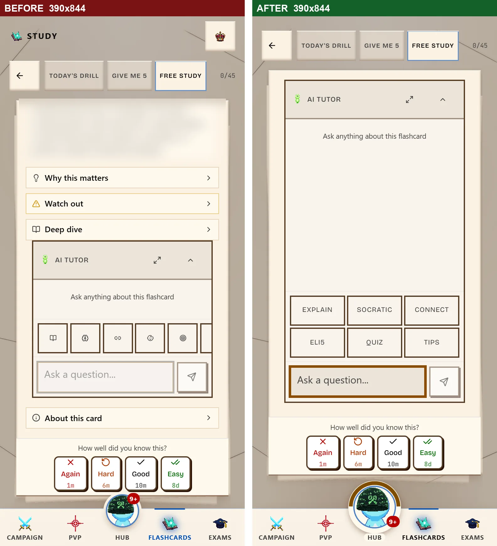
I also measured the contrast of everything the tutor draws, in 50 states across light and dark. The first pass found 10 distinct failures in 1,452 checks. The hint text in the “Ask a question” box measured 2.53:1 in light mode, against the 4.5:1 that WCAG AA sets for body text. The box’s border measured 1.12:1, which is close to invisible. The same audit now finds none in 1,326 checks.
Two smaller ones. Keyboard users get a visible focus ring on the question box and on the tutor dialog’s close button. And with OpenDyslexic, the largest text size and wide spacing all switched on at 360 pixels wide, the mode buttons drop to two per row instead of spilling out of their boxes.
Nothing changed about energy, pricing or what the tutor answers.
The phone layout lost a row
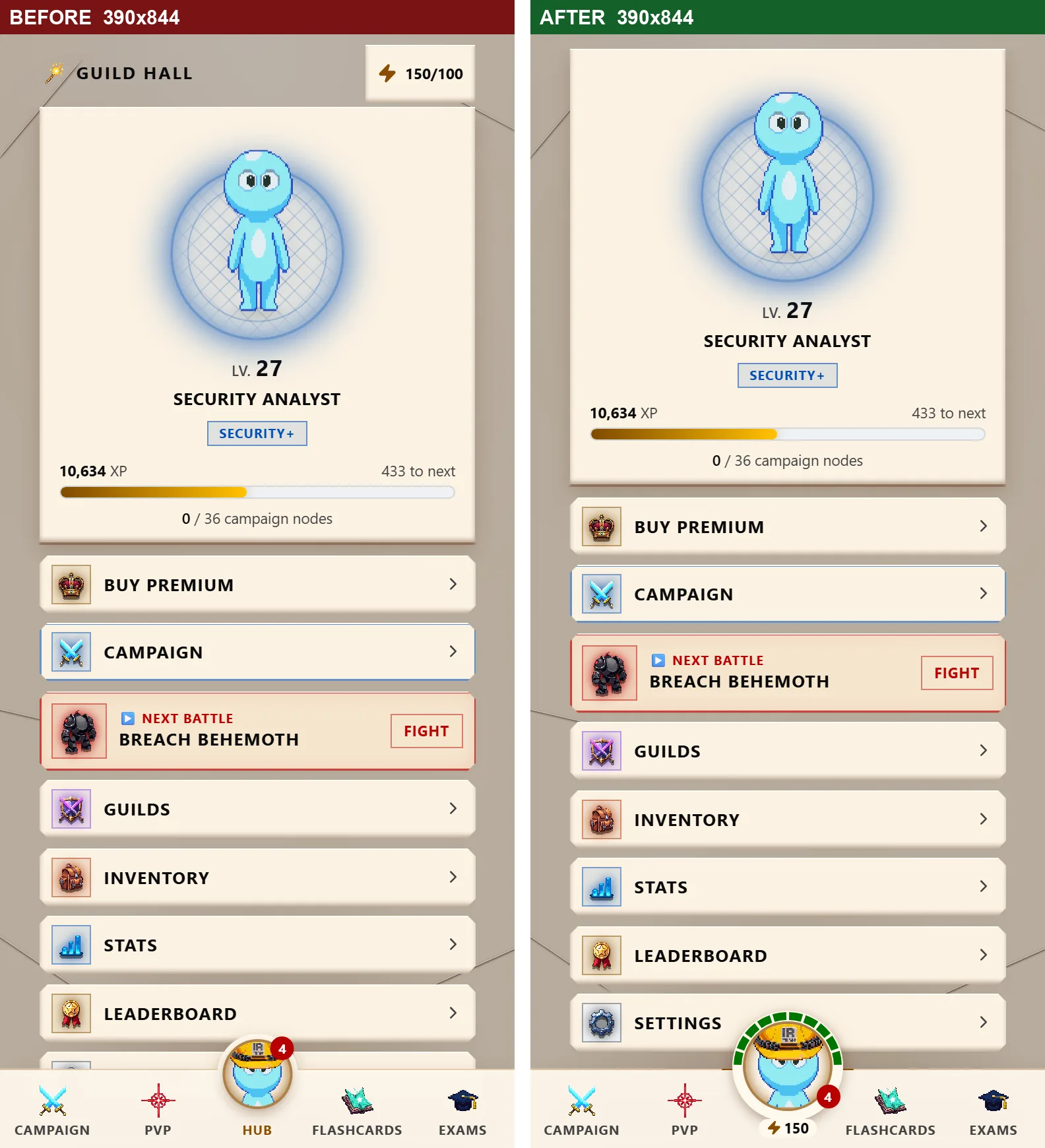
On a phone, every page used to start with a row holding an energy chip and a premium crown. That row is gone. Each page starts with its own title, and flashcard study starts with the card.
Energy moved to the Hub button in the bottom bar, which grew from about 53 pixels to 68. On the free plan it carries ten pips around its top, one for each battle you can afford, with the number underneath. A battle costs 10 energy. Below that, no pip is lit and the number turns red. Premium members see one gold arc and the word Hub.
Open the Hub drawer and energy is the first thing in it: your count, the time to the next point and a ten-segment bar. Below the cap of 100 it offers Refill next to Unlimited energy with Premium, and when you can’t afford a battle it says so. Nothing on the button or the gauge animates. I keep the Hub still on purpose.
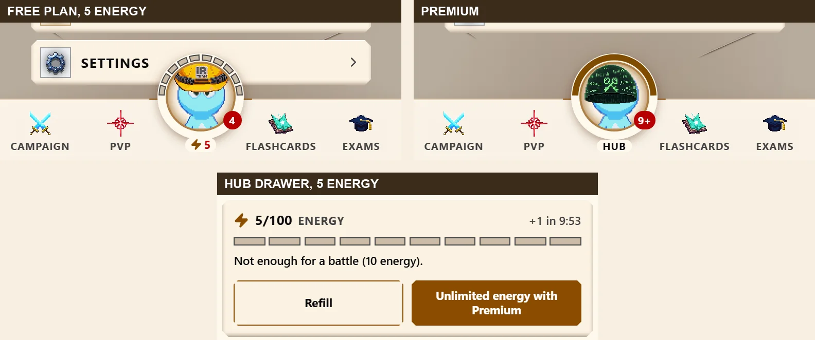
In dark mode the active tab’s label in the bottom bar was the accent color on a dark background, between 4.2:1 and 4.4:1. It’s 15:1 now. The energy count measures 6.4:1 at its lowest and the red low-energy count 5.3:1 in dark mode. One older row in the drawer, Continue / Fight, still measures 4.37:1 in dark mode at its worst pixel, just under the 4.5:1 line. It was the same before and it isn’t fixed yet.
Three ways a paying member got treated as free
The first was on reload. If you pay for SecuSpark and reloaded a page within five minutes of the app’s last check of your plan, parts of that page could go on treating you as a free account until you moved to another page. On staging before the fix, a premium account going from the home screen to the inventory, to Settings and back to the inventory saw the free energy meter instead of the crown on all three later pages, and the Energy page sat on its spinner. The exam list could show practice exams past the free ones as locked. Every part of the page now reads your saved plan when it loads. After the fix the same account got the crown on every page and every reload, and none of the 75 Security+ exams showed a lock.
The second was at sign-in. Right after a password sign-in, the app could decide you were on the free plan before it had read your plan, and show an Upgrade nudge in the account menu, the Free card in Settings or a paywall on a premium exam while that read was in flight. Those screens now wait for the read.
The third was a plan read that failed, from a network or database hiccup. The app took a failed read as the free plan. Now it says so instead. The exam list and the exam show “We could not check your plan”. The Energy page and the Subscription card in Settings show “We could not load your plan” with a Try again button, in place of the free plan, the energy packs and the upgrade link. Before a battle, the energy cost line stays hidden while your plan is read again, and the battle charges energy only once your plan is known. On staging, with a read that failed and then loaded, a free account was charged once and a premium account not at all.
On phones the new layout closes most of what was left. The bottom bar shows no energy gauge until your plan is known, about one to two seconds on a cold load, so a paying member no longer sees the free meter while it loads. One piece is still open on desktop: on a cold first load, a paying member can see the free energy meter for about half a second before the crown replaces it. I haven’t fixed that one yet. Nothing about plans or pricing changed.
Tell me what I missed
I found these by looking, and I can only look at so many screens. The feedback button in the app comes straight to me and I read every message. Detailed feedback earns 3 days of premium, once per account, whether the news is good or bad.
How this was made: I build SecuSpark with AI coding tools and drafted this post with one. The answer positions in the table were counted in a browser on the staging build before the fix, and the two AI exams were checked there again after it. The other four exams were counted from the question bank. The contrast numbers come from measuring the tutor and the exam screens as they render.

Earn XP while you study
Battle bosses while studying for Security+
Earn XP, level up, and master domains in the only RPG cert prep game. Free to start.
Stop Reading, Start Practicing
7,500+ practice questions across 7 certification paths: Security+, A+, Network+, CySA+, PenTest+, SecAI+, and Claude Architect. 3 free exams per cert to start. Campaign Pass unlocks all exams, premium AI deep dives, and the RPG battle campaign.
Free Study Tools
Related Articles
You Said, We Did: Ten Fixes From Player Reports
Two players showed that duels rewarded weak gear. A learner saw two answers flash red. Ten player reports, what each one found, and what changed because of it.
Review Mistakes Kept Restarting. A Learner Caught It.
Since mid-August, Review Mistakes sent you back to question 1 after your second answer. A Security+ learner reported it. What broke, why it hid, and the fix.